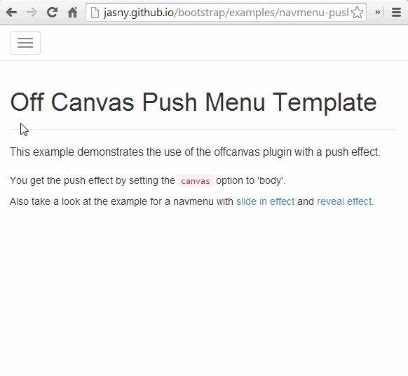
A Push Menu is a navigational menu that is placed off canvas and brought into view when the user performs a particular action.
Check out this example of a push menu by clicking the hamburger menu icon at the top left of the page. Watch as the menu slides into view and pushes the rest of the screen away at the same time.

Let’s explore some of the reasons Push Menus can be effective on the web.
Pros
Great at Handling Complexity
Out of all the ways to display navigation options, Push Menus probably afford the designer the largest amount of space to work with and the greatest flexibility.
Lots of Push Menus provide comprehensive navigation options and maintain the feeling of hierarchy using spacing, typography, colouring and various other design techniques.
Screen Real Estate
As Push Menus are completely hidden off-screen when they are not needed, the only screen real estate they take up is the mechanism to show them, typically a button.
This makes them one of the most spacially effective ways to display large amounts of navigation options.
Follows Convention
The Push Menu breaks rule number 1 of UX Design, Visibility (More on that below). Some users therefore have difficulty when trying to navigate with it.
However since being pioneered by big names like Facebook and Google, the concept is much more universally understood.
Thanks to convention Push Menus are now familiar enough to users that their invisibility is less of a problem. Designers can now benefit from their flexibility.

Great at handling hierarchical and complex navigation structures, and can save you some valuable screen real estate
Cons
Visibility
As mentioned above, the Push Menu breaks the UX Designer’s number 1 rule of visibility!
In order to be effective, all functionality on a page should be visible to the user. This is not the case with a menu that is off screen, and the “hamburger” icon that could be misconstrued for a tasty snack.
Platform Compatability
Certain older browsers and devices might have difficulty displaying a Push Menu, depending on the way it has been implemented.
Most rely on CSS3 transformations meaning that the menu won’t work on older browsers. Some rely on javascript, meaning that browsers with javascript disabled will have a significant experience disadvantage.
Slower Usage
One main disadvantage is the need for the user to click twice in order to navigate - once to open the Push Menu, and a second time to click the link they want.
This slows down your users, which is bad considering most users want to get in and out of your site quicker than you can say McDonald’s.
Breaks the rule of Visibility, can be difficult to implement across platforms, and slows down navigation speed
Conclusion
So, Push Menus are great when you have a complex and hierarchical navigation structure.
But they should only really be used on screens that are small or touch screen because they slow down the browsing experience and would take our visitors by surprise if used on dekstop sized screens.
Shrink down this page to checkout my implementation of a Push Menu!
